Visualization Examples
Popular tools like t-SNE and UMAP can produce intuitive and appealing visualizations. However, since they perform opaque non-linear transformations of the input data, it can be unclear how to “tweak” the visualization to accentuate a specific aspect of the input. Also, it can can sometimes be difficult to understand which features (e.g. genes) of the input were most important to getting the plot.
Schema can help with both of these issues. With scRNA-seq data as the primary modality, Schema can transform it by infusing additional information into it while preserving a high level of similarity with the original data. When t-SNE/UMAP are applied on the transformed data, we have found that the broad contours of the original plot are preserved while the new information is also reflected. Furthermore, the relative weight of the new data can be calibrated using the min_desired_corr parameter of Schema.
Ageing fly brain
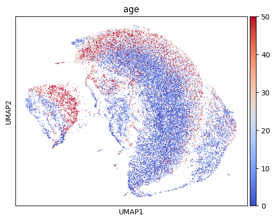
Here, we tweak the UMAP plot of Davie et al.’s ageing fly brain data to accentuate cell age.
First, let’s get the data and do a regular UMAP plot.
import schema
import scanpy as sc
import anndata

def sc_umap_pipeline(bdata, fig_suffix):
    sc.pp.pca(bdata)
    sc.pp.neighbors(bdata, n_neighbors=15)
    sc.tl.umap(bdata)
    sc.pl.umap(bdata, color='age', color_map='coolwarm', save='_{}.png'.format(fig_suffix) )
adata = schema.datasets.fly_brain()  # adata has scRNA-seq data & cell age
sc_umap_pipeline(adata, 'regular')
This should produce a plot like this, where cells are colored by age.
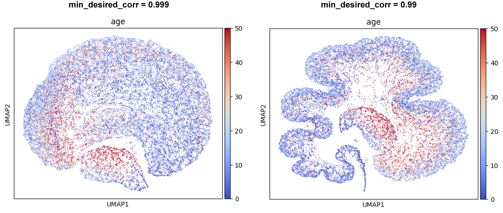
Next, we apply Schema to infuse cell age into the scRNA-seq data, while preserving a high level of correlation with the original scRNA-seq distances. We start by requiring a minimum 99.9% correlation with original scRNA-seq distances
sqp = schema.SchemaQP( min_desired_corr=0.999, # require 99.9% agreement with original scRNA-seq distances
                       params= {'decomposition_model': 'nmf', 'num_top_components': 20} )

mod999_X = sqp.fit_transform( adata.X, [ adata.obs['age'] ], ['numeric'])  # correlate gene expression with the age
sc_umap_pipeline( anndata.AnnData( mod999_X, obs=adata.obs), '0.999' )
We then loosen the min_desired_corr constraint a tiny bit, to 99%
sqp.reset_mincorr_param(0.99) # we can re-use the NMF transform (which takes more time than the quadratic program)

mod990_X = sqp.fit_transform( adata.X, [ adata.obs['age'] ], ['numeric'])
sc_umap_pipeline( anndata.AnnData( mod990_X, obs=adata.obs), '0.990' )

diffexp_gene_wts = sqp.feature_weights() # get a ranking of genes important to the alignment
These runs should produce a pair of plots like the ones shown below. Note how cell-age progressively stands out as a characteristic feature. We also encourage you to try out other choices of min_desired_corr (e.g., 0.90 or 0.7); these will show the effect of allowing greater distortions of the primary modality.
This example also illustrates Scehma’s interpretability. The variable diffexp_gene_wts identifies the genes most important to aligning scRNA-seq with cell age. As we describe in our paper, these genes turn out to be differentially expressed between young cells and old cells.